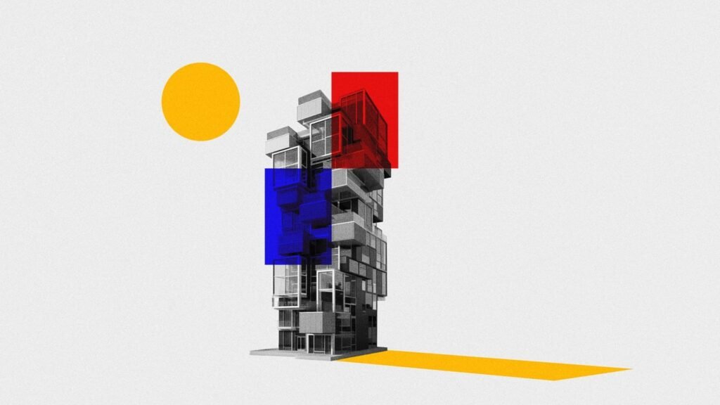
Minimalism has profoundly impacted visual design, shaping how designers approach aesthetics and functionality. By focusing on simplicity and clarity, minimalism helps create designs that are both visually appealing and user-friendly. In this blog post, we will explore the influence of minimalism on visual design, its key principles, and how it enhances both usability and aesthetics.

What is Minimalism in Visual Design?
Firstly, minimalism in visual design is an approach that emphasizes simplicity by using the fewest elements necessary to achieve a design’s purpose. This design philosophy values clean lines, ample white space, and a limited color palette. The goal of minimalism is to reduce visual clutter and focus on the essential components of the design. By stripping away unnecessary elements, minimalism helps create a clear and straightforward visual experience.
Benefits of Minimalism in Design
Moreover, minimalism offers several benefits that enhance the overall design experience. Clarity is a significant advantage; by removing excess elements, designers can make the core message or function of the design more apparent. This helps users quickly understand and engage with the content. Usability is another benefit; minimalistic designs are often more intuitive, allowing users to navigate and interact with the interface more easily. Additionally, aesthetic appeal is enhanced through the use of simple and elegant visuals, which can make a design feel modern and sophisticated. Overall, minimalism improves both the functionality and attractiveness of a design.
Key Principles of Minimalism
Additionally, there are several key principles that define minimalism in visual design. Simplicity is at the core of minimalistic design, focusing on essential elements and eliminating anything unnecessary. Functionality is also important; every design element should serve a clear purpose and contribute to the overall user experience. Whitespace plays a crucial role in minimalism by providing breathing room for elements and enhancing readability. Limited color palettes are used to create a cohesive and visually pleasing design without overwhelming the viewer. By adhering to these principles, designers can create effective and aesthetically pleasing minimalistic designs.
Minimalism in Web and App Design
In web and app design, minimalism is especially influential. Clean interfaces with straightforward navigation help users focus on key tasks without distraction. For example, using simple buttons and uncluttered layouts ensures that users can easily find and interact with essential features. Typography also benefits from minimalism; using clear and legible fonts with ample spacing improves readability and user experience. By applying minimalistic principles to web and app design, designers can create user-friendly and visually appealing digital experiences.
Minimalism in Graphic Design
In graphic design, minimalism can be seen in various applications such as posters, branding, and advertisements. Bold typography and simple graphics are commonly used to convey messages clearly and effectively. Minimalist graphic design often employs strong visual contrasts and carefully selected imagery to make a powerful impact with minimal elements. This approach ensures that the message is direct and memorable, making it easier for viewers to engage with and remember the design.
Challenges of Minimalism
However, there are challenges associated with minimalism in visual design. Over-simplification can sometimes lead to designs that lack personality or fail to communicate effectively. It is important to strike a balance between simplicity and functionality to ensure that the design remains engaging and informative. Design limitations may also arise when trying to convey complex information with minimal elements. Designers must find creative solutions to represent detailed content in a clear and concise manner. Addressing these challenges requires careful planning and thoughtful execution of minimalistic principles.
The Future of Minimalism in Design
Looking ahead, minimalism will continue to influence visual design as technology and design trends evolve. Interactive minimalism may emerge, where simple designs incorporate dynamic elements that enhance user engagement without adding visual clutter. Sustainable design practices aligned with minimalism could focus on using fewer resources and materials to create efficient and eco-friendly designs. Additionally, personalized minimalism might tailor minimalist principles to individual user preferences, offering a more customized and relevant experience.
Conclusion
In conclusion, minimalism has a significant influence on visual design by promoting simplicity, clarity, and functionality. By adhering to key principles such as simplicity, functionality, whitespace, and limited color palettes, designers can create effective and aesthetically pleasing designs. While challenges exist, careful application of minimalistic principles can lead to successful and engaging designs. As design trends continue to evolve, minimalism will remain a powerful and relevant approach in creating modern and user-friendly visual experiences.


