Data visualization is a powerful tool that significantly enhances design communication. By transforming complex data into clear, engaging visual formats, designers can make information more accessible and understandable. In this blog post, we will explore how data visualization improves design communication, the benefits it offers, and some best practices for creating effective visualizations.

The Role of Data Visualization in Design Communication
Firstly, data visualization plays a crucial role in visual design communication by simplifying complex information. Instead of presenting data in raw, numerical form, visualization turns it into charts, graphs, and infographics that are easier to interpret. For example, a line graph can show trends over time more clearly than a table of numbers. By visually representing data, designers help audiences quickly grasp key insights and trends, making communication more effective and impactful.
Benefits of Using Data Visualization
Moreover, data visualization offers several key benefits in design communication. Clarity is one major advantage; visualizations help to clarify complex data and make it more understandable. This is especially important when communicating with audiences who may not be familiar with the data. Engagement is another benefit; well-designed visualizations capture attention and make information more interesting. This can lead to better retention and understanding of the material. Additionally, comparison is facilitated through visualizations, allowing viewers to easily compare different data sets or trends. Overall, data visualization enhances the ability to communicate effectively by making information more accessible and engaging.
Types of Data Visualizations
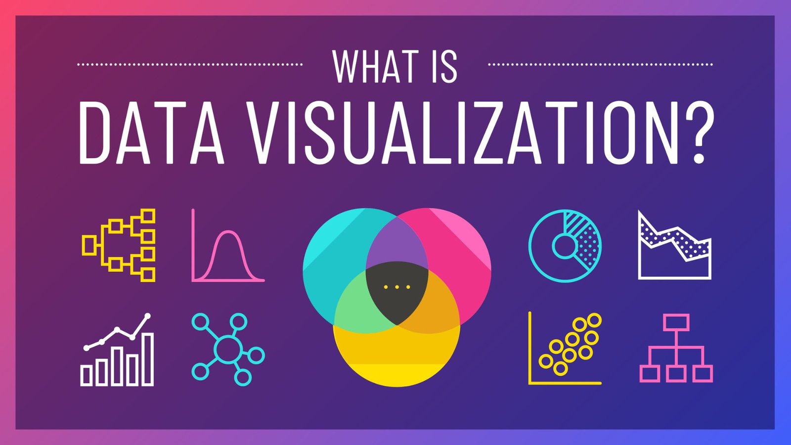
Additionally, there are various types of data visualizations that designers can use to enhance communication. Bar charts are useful for comparing quantities across different categories. Pie charts show proportions and percentages, making them ideal for illustrating parts of a whole. Line graphs track changes over time, which is great for showing trends. Scatter plots reveal relationships between two variables, providing insight into correlations. Heat maps use color to show data density or intensity, which is useful for identifying patterns. Choosing the right type of visualization depends on the nature of the data and the message being communicated.
Best Practices for Effective Data Visualization
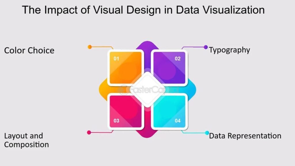
For effective data visualization, there are several best practices to consider. Keep it simple: Avoid cluttering visualizations with too much information or excessive detail. Focus on the key message and ensure that the visualization is easy to interpret. Use clear labels and legends: Proper labeling helps viewers understand what they are looking at and how to interpret the data. Choose appropriate colors: Use colors to highlight important data points and ensure that they are easily distinguishable. Avoid using too many colors or those that may cause confusion. Ensure accuracy: Double-check that the data is correctly represented and that visualizations accurately reflect the information. Accurate visualizations build trust and credibility.
Challenges and Solutions in Data Visualization
However, there are challenges in data visualization that designers should address. One challenge is data overload, where too much information makes visualizations difficult to understand. To overcome this, focus on the most relevant data and use techniques such as data aggregation or filtering. Misleading visuals can also be an issue; for example, poorly designed graphs can distort the data. Ensure that visualizations accurately represent the data and avoid manipulative practices. Accessibility is another concern; ensure that visualizations are accessible to people with visual impairments by using high-contrast colors and providing alternative text.
The Future of Data Visualization in Design
Looking ahead, the future of data visualization in design is likely to involve more advanced technologies and methods. Interactive visualizations will become increasingly common, allowing users to explore data and gain deeper insights through interaction. AI and machine learning may also play a role, offering new ways to analyze and visualize large data sets. Additionally, real-time data visualization will provide up-to-date information, enhancing the relevance and timeliness of the data presented. Staying informed about these advancements will help designers create cutting-edge visualizations that meet evolving needs.
Conclusion
In conclusion, data visualization enhances design communication by making complex information more accessible and engaging. By using various types of visualizations, following best practices, and addressing challenges, designers can effectively communicate data and insights. The future of data visualization promises even more innovative and interactive solutions, further improving how we present and understand information. Embracing data visualization in design projects not only enhances communication but also drives better decision-making and understanding.


