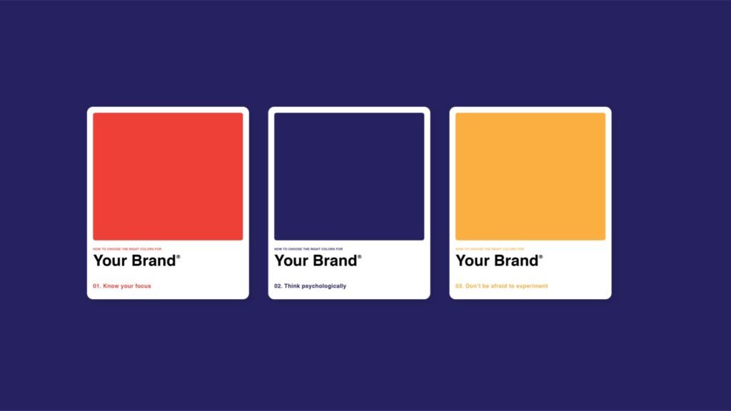
Selecting the right color palette is crucial for creating a visually appealing and effective design. Colors not only enhance aesthetics but also influence perception and convey your brand’s message. Here’s a guide to choosing the right color palette for your design.

Understand Color Psychology
Color psychology explores how colors affect emotions and behaviors. Start by understanding the psychological impact of different colors:
- Red: Excitement, energy, passion
- Blue: Trust, calm, professionalism
- Green: Growth, health, tranquility
- Yellow: Optimism, creativity, warmth
Choose colors that align with the message and emotions you want to convey.
Consider Your Brand Identity
Your color palette should reflect your brand’s identity and values. Analyze your brand’s mission, vision, and target audience. Select colors that resonate with these aspects and reinforce your brand’s personality.
Use the Color Wheel
The color wheel is a tool for understanding color relationships. Use it to create harmonious color schemes:
- Analogous Colors: Colors next to each other on the wheel, creating a cohesive look.
- Complementary Colors: Colors opposite each other on the wheel, offering high contrast and visual interest.
- Triadic Colors: Three evenly spaced colors on the wheel, providing balance and diversity.
Start with a Base Color
Choose a base color that aligns with your design’s purpose and brand identity. This color will be the foundation of your palette. From this base, you can build a harmonious palette by selecting complementary and accent colors.
Create a Balanced Palette
A well-balanced palette includes a mix of primary, secondary, and neutral colors. Consider using:
- Primary Colors: Main colors that dominate your design.
- Secondary Colors: Colors that complement or contrast with the primary colors.
- Neutral Colors: Shades like white, gray, and black that provide balance and help other colors stand out.
Test Color Combinations
Test different color combinations to see how they work together. Use design tools or color palettes to visualize how your colors interact. Ensure that your chosen colors provide sufficient contrast for readability and visual appeal.
Consider Accessibility
Ensure your color palette is accessible to all users, including those with color vision deficiencies. Use high-contrast color combinations and check your design with accessibility tools to ensure it meets accessibility standards.
Stay on Trend
While staying true to your brand identity, consider current color trends to keep your design modern and relevant. However, avoid overemphasizing trends if they don’t align with your brand’s long-term vision.
Get Feedback
Seek feedback from colleagues, stakeholders, or design professionals. Their input can provide valuable insights and help you refine your color palette to better meet your design goals.
Document Your Palette
Once you’ve finalized your color palette, document it for consistency. Create a color guide that includes color codes (hex, RGB, CMYK) to ensure uniformity across all design materials.
Conclusion
Choosing the right color palette involves understanding color psychology, reflecting brand identity, and creating a balanced and accessible design. By following these steps, you can select a color palette that enhances your design, resonates with your audience, and effectively communicates your message.


